“I don’t want to copy the photo! I want my paintings to be looser, more abstract.” Sound familiar? I hear this all the time! Recently, I was invited to do a demo for the Southeastern Pastel Society on this very topic: Moving Towards Abstraction.
While in teaching I usually focus on colour and using a limited palette (you know I love a good limited palette!), this opportunity felt like an exciting nudge to explore and teach something new as it’s something many artists are hungry for.
So I thought I’d share some highlights from that demo here on the blog, along with a peek at what I created and what the experience opened up for me.
What is Moving Towards Abstraction?
For me, it’s not about abandoning the real world or painting in a purely abstract way. (That would mean painting non-objectively.) It’s about loosening the grip on reality — simplifying what you see, leaning into what you feel, and giving space and shape to your own voice.
It’s letting colour, mood, shapes, and mark-making take the lead over representational accuracy. It’s making room to express something about mood and emotion. It leaves room for interpretation.
It’s about choosing your focus: What matters most in this scene? What do you want to say?
Moving towards abstraction is not about making a single leap. Instead, it’s about a series of small intentional shifts.
And a good way to start is with small, playful experiments.
From a Simple Scene to Playful Possibilities
For the demo, I chose a straightforward reference photo — trees on a hill. Something with structure but with enough room to experiment and quickly show different possibilities.

Next, I created a series of thumbnails to explore value structure, composition, and format. Thumbnails are always a great place to begin exploration of the possibilities!

You’ll see I created two options in the square format and I had the group choose the one they wanted me to use. Option A was the winner.

From that thumbnail, I drew up and then made four small colour studies — each a different path towards abstraction:
- Colour play one — using a monochromatic palette
- Colour play two– using intense colour in more graphic flat shapes ie pushing away from the illusion of depth in a landscape
- Colour play three— using neutrals and intense colour together
- Mark-making — exploring energy and texture

Each study revealed something new — not just about the scene, but about what excited me as a painter. They gave me permission to experiment and play, with no pressure to “finish.” And you can see how the possibilities are endless!
And that was the end of my online presentation.
Then Someone Asked…
“Are you going to take any of those into a finished painting?”
Which honestly hadn’t crossed my mind — but once the question was out there, I thought… why not? This would push me!
So I chose one of the colour studies (at lower right) and created a larger version. I was also pulled to the top right one so I gave that a try too!
Here’s What I Discovered
Although I was only working 8 x 8 in, I instantly noticed that there’s a lot more space to deal with! And how do you cover it without just “filling it in?” I found myself overworking and fiddling the thing to death, losing the energy as well as the simplicity that I loved in the study.
It’s soooooo easy to do this!
But I found the solution isn’t to back off — it’s to go deeper:
- Be bold enough to make changes, even over passages you like. Whoosh, away they go!
- Trust the study’s energy more than your urge to refine. Hold back.
- Remember what you’re trying to say — and say that. This goes back to your intention
It was all kinda scary… but also exhilarating!
A Quick Note About Paper…
One unexpected reminder? The impact of paper colour!
My studies were done on a mid-grey paper (Canson Mi-Teintes “felt grey” – a fav for exercise work!), but I used cream paper (UART) for the larger works. And wow — what a difference! You’ll see in my paintings below that, even though I used the same pastels in both the study and the painting, things look quite different. Oops.
So remember: use the same colour surface for your painting as you do in your studies! Ideally, it’s the same exact paper.
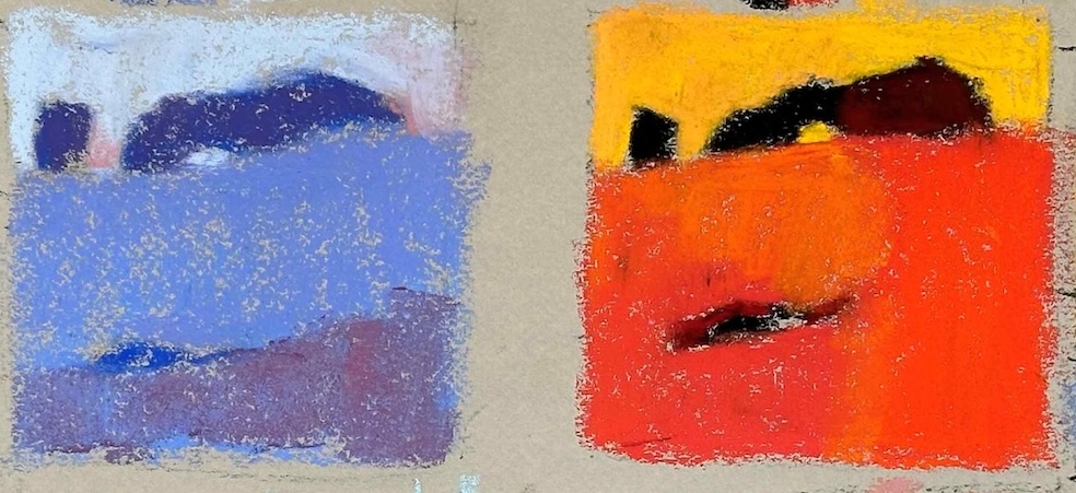
Here are my paintings:


Try This Yourself
Choose a simple photo. Make a number of thumbnail options. Choose the one that calls to you. Then put the photo away.
Now make four small colour studies, each one focused on a different element — for instance colour, shape, value, mark. Let go of “getting it right” and just explore. Play and see what happens. Have no expectations. See what emerges.
Then step back.
Which one pulls you in?
You might just surprise yourself with what shows up when you move away from the photo instead of trying to recreate a duplication of it.
A Word About Photos…
They’re useful, yes — but if you’re after moving to abstraction, your photo reference might be your biggest saboteur. It will constantly tug you back to reality, back to what “should” be.
So try this: once you’ve chosen your direction, put the photo away. Yes, really. Hide it. It will always pull you back toward detail, accuracy, and the gravitational pull of “just fixing that one little thing.”
To Wrap Things Up…
If you’re feeling the pull toward abstraction, you don’t have to leap into the unknown. Start small. Try variations. Follow your curiosity. And know that there’s no one right answer — just the next thing to try.
The moving towards abstraction path isn’t a straight line — it’s a series of creative detours.
And sometimes, those detours lead exactly where you want to go.
Have you got a photo you’ve been wanting to paint more abstractly? Do it!! Try one of these moving towards abstraction ideas then post it and tag me @howtopastelwithgail.
Until next time,
~ Gail
PS. Here are some questions to help you move towards abstraction
- What drew me to this scene in the first place — and how can I emphasise that?
- Which elements are essential, and which can I simplify, exaggerate or leave out?
- What’s the overall mood or feeling I want to convey?
- Could I crop the image or zoom in to focus on a strong shape or pattern?
- What if I changed the colour palette – limit it, focus on intensity, exaggerate value contrast, play with colour temperature?
- What would happen if I used bolder, looser marks?
- Have I put the photo away — or am I still copying it too closely?
- What risk can I take in the next version?
- Am I overworking the painting — or can I step back and let it breathe?
Trending Products