Kira Ru-djen. I didn’t know her name before April 2025.
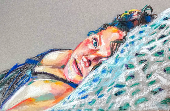
Avoiding my easel (a habit I reeeaaallly try to resist), I found myself scrolling Facebook. But that day, it paid off. I came across a portrait by this unknown-to-me artist, Kira Ru-djen. Bold and colourful, with fearless mark-making, it showed a freckle-faced 13-year-old girl — full of life and the beautiful awkwardness of that age. I immediately went looking for more and ended up on Kira’s website.
And I was delighted by what I found!
Which is why I reached out to Kira to invite her to contribute a guest blog. As you now know, she said yes.
Don’t know her work? Here’s a taste!

Before I hand you over to Kira, here’s a bit about her.
Kira Ru-djen Bio
Working primarily in soft pastel, Kira Ru-djen explores landscapes from their travels, heartfelt portraits, and the timeless forms of human anatomy. Their ambidextrous approach imbues their work with a distinct energy and vibrancy that celebrates their deep love for life. Kira’s work has been exhibited in galleries across the Midwest, featured in diverse zines and online blogs, and was recently awarded first in a plein air competition celebrating small town America. She is a member of the Pastel Society of America and is currently based in Pennsylvania. Check out her website here.
And now, here’s Kira Ru-djen!!
~~~~~
I’ve been working from skeletons on and off for as long as I can remember. Years ago, in figure drawing class in college, we had several skeletons I loved so much I included the work I did from them in my baccalaureate show. Having taken many art history classes, I found something poetic — even romantic — about working from bones. Artists have been painting skulls and skeletons for as long as forever and for as many reasons as anyone can count, so doing it in my own way feels like joining a long, deep tradition.

When I paint landscapes or figures, I’m trying to recreate a feeling — an understanding of a place or person. I want to weave my comprehension of what I’m seeing into a kind of visual evidence that I’ve been there, met them, seen that. My approach is how I show how I feel. And I put a lot of pressure on myself to make that joy visible early on. The work is an invitation to see how I see.


There’s a kind of freedom I feel when working from bones that I don’t get with other subject matter. Human anatomy feels familiar now, and I find reading it for artworks meditative — more so than anything else I paint. The audience already knows what skeletons look like, what skulls look like, so realism isn’t the goal. What I’m after is a compelling interplay of line and colour — a chance to “stretch my legs.” These pieces are an invitation to see how I think.
While I work through the final stages of all my pieces in a similar way, the looseness comes earlier on with the skeleton work — or skelebuddies as I call them. I play much more with line, and that makes the time at the easel feel different — more relaxing.

Every piece begins with a vine charcoal sketch, done two or three times as I get to know the subject, understand what I am seeing. This reading of the reference — while moving both hands across the paper — helps me place it in space. I start with my dominant (left) hand, trying out the composition. Then I erase and do a looser sketch with my other (right) hand, and see if I’ve placed it a little more to my liking or perhaps it’s more proportionally correct. I often erase that one too. The final pass is with both hands, and that’s the one I keep.

For the first sketch, I rarely look at the paper. I clamp a work phone with the reference image next to my board and do a “blind” sketch with my dominant hand. This helps me read the image quickly and see what first caught my interest.
The second pass, with my non-dominant hand, is naturally looser, and I watch the paper more as I begin combining what I’m seeing and reading. Working ambidextrously has sped up my process and added a looseness that keeps me interested — even in the annoying middle parts of the process.

Each sketch includes a subtle twirl of the charcoal stick, almost at random, to keep the lines broad and open. This approach is different from creating exact direct lines. This technique — something I picked up from Misha Bart – has transformed my work. (Misha, a mathematician and post-figurative artist, draws without references or plans, and is a great artist to follow.)
Working this way gives me space to understand the piece — to figure out how I want it to sit on the paper. I’ve rushed too many ideas in the past and later regretted the composition. Committing to a two-sketch minimum for every piece has helped me avoid that regret.


Composing with skeletons can be tricky — it’s easy to make them look awkward or floating rather than with character. Because it’s such a well-worn subject, I feel a kind of weight to get it just right — I don’t want the piece to feel like it’s just a colour-and-line study. I want it to become something in its own right. I won’t know if it has a “voice” until I’m nearly finished.
When the bones of the piece have been placed (pun absolutely intended), I seek out the second-most common lighter mid-tone — maybe peach, mint green, pale yellow, or pink — to build on. I avoid blue at this stage; it’s too dominant and better reserved for articulating edges or adding clarity.

I say “second-most common” because a “bone” colour is the obvious choice, but using it early on would flatten the piece. I avoid that flatness by finding colour within the value shifts, letting the literal bone colour be one of the least-used hues.
Next, I might add a gentle shadow — either a slightly deeper version of the colour I just used or an opposing one. Or perhaps a highlight instead, chosen with the same logic. I avoid the ends of the value spectrum for as long as I can — keeping the piece open and interesting. I’ll only dip into the darkest darks or lightest lights when I need more clarity.

These mid-tone marks are broad and loose, a step beyond the charcoal sketch. When the forms feel clear, I begin to crystallise decisions — highlighting edges with electric yellow or vivid white to bring forms closer, or deepening shadows with royal violet, dark brown, or navy to push forms away. Rarely will I use black – it’s a more sticky choice that can be hard to correct so I use it very sparingly.
I repeat colours in at least three places — always. That helps balance the piece and unify the composition.
Looking at the developing piece, sometimes via a photograph, I can see the piece more clearly and note distracting areas. I might remove parts of the original sketch with a stiff brush and gum eraser to take away what needs to be taken away.

That trick — photographing the work as if for social media — helps me know when it’s finished or if it still needs some work. Seeing it on a digital screen gives me distance and perspective, as though I’m the viewer instead of the artist. It lets me see the piece as a whole, not just as a series of choices and decisions, and helps me see what I like and don’t like.
It’s worth mentioning here that about 70% of the time, I’m recording a time-lapse video of my process to share. The honesty of this helps me stay focused on my work (as I can be easily distracted!). Knowing I’m sharing publicly with people who care keeps me on my toes.
Back to the easel. As forms emerge, I add something loud and wiggly. A risky or noisy move breathes life into the piece and forces improvisation. If I’ve used blue in shadows, I might playfully add electric red — the pairing makes the piece vibrate. If I’ve used brown, I’ll try violet or deep teal. Browns and purples together suggest life in the skull.

And when I’m unsure, but I want to make a move, I reach for my trusty vintage Winsor & Newton yellow — soft, buttery, and vibrant. It skates across the page easy as you please, like loud, bright butter.

Reserved for only this part of the process, I go in with tension and a kind of attack, with frenetic energy. I place the marks quickly and instinctively -– in the brightest brights, or as an addition to a more boring mid-tone, or maybe off the form entirely in some gestural calligraphic squiggle on the side. It all takes less than a minute.
I use this device across many of my works, but most freely with the skelebuddies. In a figure, it might be a fold in the clothes. In a landscape, it could be where the edges of rocks sit in the water or where the trees begin to blend together.

These moments, of frenzied working, bring vulnerability to me as an artist. It speaks to the delight in painting. That bouncing energy — the dance across the composition — is where I find the most stability as an artist as the thought of the number of past and present work can feel crushing at times.
I know skeletons and landscapes and figures will always be rendered skilfully — even in this era of rising AI. But no one else can embody my exact response to what I’m seeing. There’s always room for more honesty in art, and I love this part of the process.

Sometimes, these frenzied marks create something entirely new — a propeller hat appeared in one piece a few years ago, and this fun improv moment became the north star for the rest of the work. In a recent commission, a heart landed right on top of the model’s pregnant belly. These moments can’t be planned or happen intentionally.


I might return to this technique once or twice more, but it’s punctuation — not prose. I may soften it later with a brush or blending, or leave it raw, as is. The rest of the work is a call-and-response: using an opposite or related colour or value. It’s only at this point that I reach for my darkest darks. As this can mean bringing to the end the fluidity of my choices, this part always makes me nervous.

When I find I’m just “futzing,” I usually have already come to a decision on whether the piece will have a voice or be open to interpretation. Sometimes, a skelebuddy will seem so full of character that a little sentiment or quote “appears” clearly. It may be cheeky or uplifting, neurodiverse musings or quiet humour. I trace it in charcoal and place it carefully. I never start a piece with a saying in mind. It’s through the unfolding of the work that the words appear.

Other times, the skelebuddy is complete without words.

Hearing what viewers see in them, how they feel, how they bring their stories to them, is a wonderful experience. Even close artist friends who share many of the same inspirations as me will interpret something completely different about a skelebuddy.
Ultimately, my work comes from a place of vulnerability, reverence, and invitation. I want to show how I think, feel, and see — with or without words.

My hope in sharing my layered process so specifically is to express how intertwined improv and intention are in my art. I’ve loved being a student of art history for as long as I can remember, and knowing that artists across time have found their own ways to insist on their existence through their work fills me with gratitude for being an artist.
Despite the ever changing landscape of art and the growing irreverence towards traditional artists, I’m very glad to continue making work in the way that I do — for as long as I can.
*****
Ohhhhh I hope you enjoyed seeing Kira Ru-djen’s work and learning how she puts them together as much as I did. Maybe they’ll encourage you to be just a little bolder in your own work!
We want to hear from you so please be sure to leave a comment for guest artist Kira Ru-djen and me 😀
Until next time!
~ Gail
Trending Products