In this article, I explain the pointillist technique by looking at works by the artists who created it – Georges Seurat and Paul Signac – and others who embraced it, like Anna Boch and Lucie Cousturier. And then I demonstrate how to achieve the pointillist technique in your own work, using oil and acrylic paint, pencil, and pastel. Articles in the Techniques Series define the meaning and context of art making processes and give practical tutorials on how to work with them.

Pointillist Techniques for Painting and Drawing
Definition: Pointillism is the application of small dots of pure colour that form a complete image when viewed from a distance. The technique relies on optical mixing, where instead of combining colours on the palette, our eyes merge the adjacent dots to reveal form, value, and space.
What is the Effect of Pointillism?
When pointillism is executed well, it conveys to the viewer that the artist has a deep understanding of colour. These works often use complementary colours to create contrast and visual interest. And they have soft transitions between tones by diffusing the dots of one area with those nearby. Since these artworks rely on optical mixing, the placement and intentional colour choice of each area of dots must be made carefully to reveal the intended imagery. Any out-of-place colours would disrupt the overall harmony of the image, so the painter must also be able to envisage the outcome as they work.
Pointillist paintings also often appear brighter or more saturated than other paintings. This is because each dot is made of pure colour, with some of the ground showing between them. This gives the painting a sense of vitality, a shimmering quality, or even a rippling, dreamlike sense. Without mixing, pointillist paintings avoid the problem of muddy colours.
Today, pointillism takes on new meaning, as its dot-based technique echoes CMYK printing and digital screens. Although the prophetic technique predates both of these advances, to our contemporary minds, we may draw associations with technology when it is used in artworks today.
The History of Pointillism
Georges Seurat and Paul Signac were invested in the science of colour when they created the art movement known as Pointillism. They were especially interested in the findings by the scientist Michel Eugène Chevreul and his 1839 publication Principle of Harmony and Contrast of Colours and Their Application to the Arts. After being appointed the director of a dye works in Paris in 1824, Chevreul began delving into how to make colours appear stronger. This was in response to complaints about a weak black dye. He discovered that although the dye was high quality, when it was surrounded by threads that were deep blue or purple, it appeared weaker and reddish. He realised that the human eye perceives colour in relation to its neighbouring colours, calling the effect ‘simultaneous contrast’.

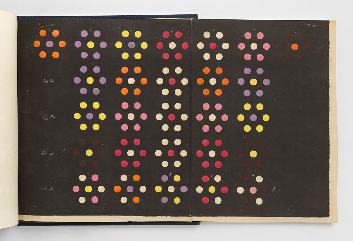
Des Couleurs et de leurs Applications aux Arts Industriels à l’Aide de Cercles Chromatiques
(Colours and their Applications to Industrial Arts Using Colour Wheels), 1864, page from book
Michel Eugène Chevreul
Steel plate engraving printed in colour, 36.2 x 28.6 cm | 14.3 x 11.3 in
The Metropolitan Museum of Art
He expanded on his discovery in his 1839 book by claiming that complementary colours – those opposite to each other on the colour wheel – would appear brighter when placed next to each other. And when on a smaller scale, such as individual threads next to each other in a textile, complementary colours would appear as neutral colours from a distance. For instance, a blend of blue and orange threads would appear grey after taking a step back. In this example from a page in his book, we can see one of Chevreul’s examples of colour relationships that the pointillists were referring to. Seurat and Signac used the findings in this book as the foundation for developing their technique by creating thousands of tiny colour relationships in the form of dots all over their canvases.
De la loi du contraste simultané des couleurs, et de l’assortiment des objets colorés, considéré d’après cette loi (On the law of simultaneous contrast of colors, and of the assortment of colored objects, considered according to this law), 1839, page from book
Michel Eugène Chevreul
Coloured lithograph foldout
The Metropolitan Museum of Art
Seurat also believed that pointillism was a technique that could mechanise painting, with the intention that anyone could replicate it. He lived at a time when the Industrial Revolution was rapidly shifting established ways of life in cities, and he saw the social consequences play out before his eyes. His paintings not only depicted the upper classes of Paris, but the working class in equal admiration. He saw his work as a form of labour, not so different from the factory workers around him, so he worked out a strategy for pricing his paintings concurrent with a worker’s wage in Paris per hour of work.
The repetitive dotting method reflected a turn towards mass production, and people doing jobs where they endlessly repeated the same action in factories. In his painting Circus Sideshow, we see a depiction of a group of performers trying to entice the public into their tent to see the full show, which was a popular form of entertainment for the working classes at annual fairs.


Circus Sideshow, 1887-88
Georges Seurat
Oil on canvas, 99.7 x 149.9 cm | 39.3 x 59 in
The Metropolitan Museum of Art
Seurat’s friend Paul Signac was equally a pioneer of Pointillism, and notably applied the technique to printmaking in his coloured lithographs. We can see here in his work Le Soir (Evening) a luminous boating scene applied in dots of colour in five layers.

Le Soir (Evening), 1898
Paul Signac
Five colour lithograph on paper, 20.3 x 26.4 cm | 8 x 10.4 in
National Gallery of Art
Other notable artists who adopted Pointillism through working alongside Seurat and Signac are Lucie Cousturier and Anna Boch. Cousturier is credited as being the first writer to focus on the Neo-Impressionists, and was a prolific exhibiting artist in her own right. Signac described her as having the “most dazzling colours” and “exquisite and natural taste for shapes”. In her vibrant Self-Portrait, we see a wonderful combination of colours dotted together that I have picked out in the cropped images

Self-Portrait, 1905-10
Lucie Cousturier
Oil on panel, 34.8 x 27.4 cm | 13.7 x 10.8 in
Newfields
Anna Boch was a Belgian painter who made pointillist paintings in her early career. She later developed her individual style and became the only female member of the Les XX group. Alongside being a prolific painter, she was also a major early collector of Post-Impressionist paintings. She was the famed collector who bought the only painting Van Gogh sold within his lifetime – The Red Vineyard. In her painting Tijdens de Elevatie (During the Elevation), we see a group of worshippers entering their Church on a Sunday morning. There are areas of pure dots of colour, and others with small dashes and some brushstrokes, showing her experimentation with combining pointillism with other forms of mark-making.

Tijdens de Elevatie (During the Elevation), 1893
Anna Boch
Oil on canvas, 74.5 x 113 cm | 29.3 x 44.5 in
Mu.ZEE
Demonstration of the Pointillism Technique for Painting
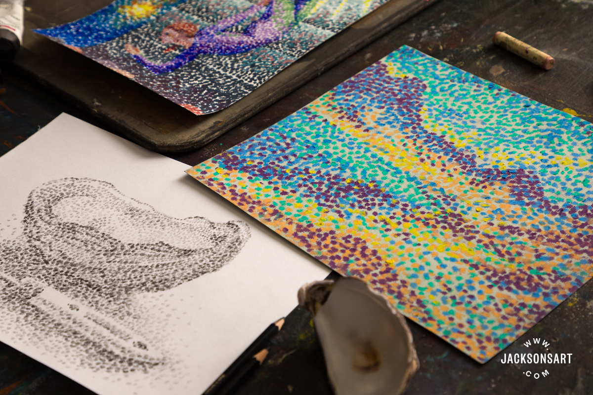
For my first demonstration, I wanted to make an example of a pointillist painting inspired by the palette of Circus Sideshow by Seurat. For my example, I used Jackson’s Professional Acrylic Paints on a Jackson’s Acrylic Paper Block. This example would also work equally as well in oil paints without using any medium, to make sure the dots don’t shift in place, or watercolour applied strongly. This is a time-consuming technique, but very satisfying once the image starts to appear in front of you.

I started my painting by doing a light underdrawing in a light blue pencil. Seurat himself made lots of preparatory sketches for his works, and his paintings all have a broad underdrawing beneath the layers of dots.

Next, I began on the central image of my work, of an aerial hoop performer. I applied the dots carefully with a small brush, focusing mostly on the figure to start with. I left the areas where I wanted to add bright lights blank for now.

After finishing the first pass of the image, I went back over the work, adding greater depth with some contrasting and darker colours next to each other.

To finish my painting, I returned to the areas I left blank and added a series of yellow to orange and green dots to create the effect of bright lights.

Tips: Don’t be afraid to overlap some of your dots or paint over some of them as you see fit. This is going to be necessary to the process, as you make decisions about the image that appears while you work. Seurat’s paintings have areas where the dots have some white ground visible around them, and others where it’s almost completely covered and layered up.
Remember to step back from the work as you’re making it – the purpose of pointillism is that the image is unified from a distance!

Demonstration of the Pointillism Technique for Tonal Pencil Drawing
Next, I wanted to demonstrate making a drawing with the pointillist technique, this time without using colour. Although the main focus of the movement was to experiment with optically mixing colour, it is also a really interesting effect when just used in tone. For this example, I used a Faber-Castell Pitt Graphite Matt Pencil in 4B on a sheet from a Jackson’s Cartridge Drawing Pad. You could also apply this technique to drawing with charcoal or graphite.

First, I made a light underdrawing of my subject – a still life of a shell and a palette knife.

Next, I began building up areas of light and mid-tones in little circles, starting on the shell. I didn’t ‘dot’ with my pencil as this would make a very tiny mark, but instead drew little circles with it, about the size of my brushstrokes from the previous example.

After building up my initial layer, I went back over the drawing to build in the darkest tones.

Tips: Working in pencil from the lightest to darkest tones allows you to erase any errors more easily. If you start a drawing with the darkest tones and then decide the placement is wrong, the pigment may be too strong to completely remove.
Demonstration of the Pointillism Technique for Pastel Drawing
Finally, I wanted to demonstrate building up a pointillist work using a limited palette in pastels. As we can see in During the Elevation by Boch and Evening by Signac, it’s possible to build up a complex image using pointillism with just a handful of colours. For the following demonstration I used Sennelier Oil Pastels on toned pastel paper.

To start, I began the work using a midtone colour, Sky Blue, and placed it around the darker edge of the sea, the top of the sky, and the blue hills in the distance.

Next, I moved on to my second colour, Barite Green. I chose this one next since I wanted to use it to meet and mix with a lot of my blue areas.

Then I added my third and fourth colours, Lemon Yellow and Bright Yellow (which is more of a peach)

To complete the work, I added my darkest colour, Red Violet, picking up some areas of deeper tone.

Tips: Working with oil pastels in a Pointillist style doesn’t give you much freedom to shift the marks you make, so if you make a mistake, it could be best to embrace it and incorporate the misplaced colour into that area of the work, by adding it in some other dots of it nearby the error. This will diffuse the ‘wrong’ placement and make it look intentional.

Further Reading
Colour Mixing: The Versatility of a Six Colour Primary Palette
Scumbling Techniques for Painting
Recreating Van Gogh’s Colour Palette with Modern Pigments
Colour Mixing : Colourist Painting with Three Colour Palettes
Shop Art Materials on jacksonsart.com

The post Pointillist Techniques for Painting and Drawing appeared first on Jackson's Art Blog.
Trending Products