In this article I explore the technique of blending, referring to examples from Sfumato paintings in the Renaissance, through to Symbolist pastel drawings. Followed by practical demonstrations for blending in a variety of mediums – oil, acrylic, pencils, soft and oil pastel, charcoal, watercolour, and ink – and give tips for achieving a seamless finish. Articles in the Painting Techniques Series define the meaning and context of art making processes and give practical tutorials on how to work with them.

Blending Techniques in Oil, Acrylic, Pencil, Pastel, Charcoal, Watercolour, and Ink
Definition
Blending refers to the mixing towards, or transition between, two or more different colours or values, to create a smooth gradient between them. A successfully blended area will have a consistent, melded-together finish, without any hard edges, lines, or random marks.
What is the Effect of Blending?
The visual effect of blending may help to achieve realism, or simply add a pleasing gradient to an artwork. Whether a work is naturalistic or abstract, areas of blending often provide a sense of depth, be it blended tone across a glass on a table or blending between bright colours. It’s a technique that’s doable in all art mediums, and can be more challenging to execute in some than others. We are used to seeing beautifully blended areas in oil paintings since it’s a technique almost as old as the history of painting itself, and the malleability of the medium makes it feel natural to the process. Seamlessly blended oil pastel or charcoal may feel more challenging to replicate, so can convey an expertise of the medium to the viewer.
History of Blending
An early version of ‘blending’ in art was known as Sfumato in Renaissance Italy, which comes from the Italian sfumare, which means “to tone down” or “to evaporate like smoke”. As the definition suggests, the tones in paintings with Sfumato are diffused and gentle, with soft seamless transitions between values. It is most commonly attributed to the blending work of Leonardo Da Vinci, who championed painting with “no lines or borders”. We see here in his solemn staring portrait of Ginevra de’ Benci, the incredibly subtle blending between the values of her face, especially around her eyes and on her cheek and jaw.
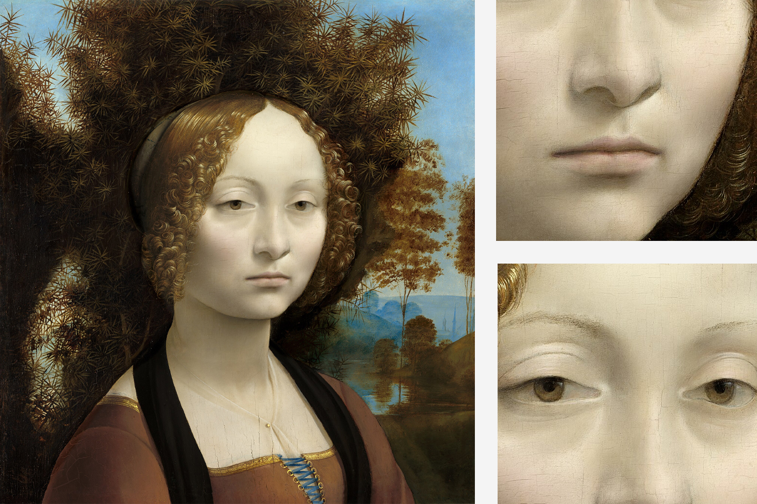
Ginevra de’ Benci, c.1474-78
Leonardo da Vinci
Oil on panel, 38.1 x 37 cm | 15 x 14 9/16 in
National Gallery of Art, Washington
Just over three hundred years later, the Spanish painter Goya was making portraits of the nobility, before making the dark satirical works in his later life that he is best known for. In his portrait of the little boy Manuel Osorio Manrique de Zuñiga, we can see a blended halo of light around the little boy that fades into shadow, as well as the blended cast shadow across the floor he stands on. The effect of blending on the lighting makes the little boy feel more fragile, or gentle, amongst his animal companions.

Manuel Osorio Manrique de Zuñiga, 1787-88
Francisco Goya
Oil on canvas , 101.6 x 127 cm | 50 x 40 in
The MET, New York
The Pre-Raphelites made use of blending to create their ethereal feminine figures, often refining and smoothing their features to convey a divinity or mythicism. Evelyn de Morgan was part of the group in its later stage and conveyed themes of feminism and spirituality through the movement. In this sensitive preparatory pastel drawing for one of her paintings Study of Arms for “The Cadence of Autumn”, we see the seamless blending between skin tones within the form, meeting the outline around the edge.

Study of Arms for The Cadence of Autumn, 1905
Evelyn de Morgan
Graphite and pastel on paper, 25.3 x 37.7 cm | 14 13/16 × 9 15/16 in
The MET, New York
Another example of blending in drawing, with elements of abstraction, fantasy and narrative, can be seen in works by Odilon Redon. His Symbolist drawings are often seen as a predecessor to Surrealism, and his drawing Saint George and the Dragon is no exception. Working in a combination of pastel and charcoal, we see a totally different treatment of the surface to the de Morgan drawing in the previous example, with very similar materials and palette. Blending doesn’t have to be solely used for observational work, which is clear to see in the powerful light burst and shadowy gradients in Redon’s drawing.

Saint George and the Dragon, c.1892
Odilon Redon
Charcoal and pastels on paper, 37.5 x 53.7 cm | 21 1/8 x 14 3/4 in
National Gallery of Art, Washington
Demonstrations of Blending
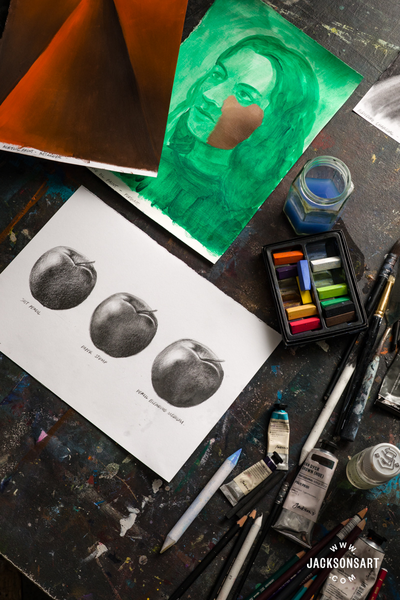
Oil Paint
Blending in oil paint is easy because of its slow-drying, malleable qualities. To start, I wanted to show some blending on a portrait over a simple underpainting, and then in a colour gradient. For these examples, I used Jackson’s Professional Oil Paints on paper from a Jackson’s Oil Paper Block.

To start, I made a simple underpainting for a portrait in Emerald Green and let it fully dry down before adding the next layer. I mixed a few skin colours on my palette before starting and then worked them onto the painting together.

Using a light touch and changing the direction of the strokes made the blend more seamless. For a refined finish, you could go over this layer with a clean soft brush, using it to smooth out the blending, without applying new paint.

For my blended gradient example, I painted the pure colours on each end of the sheet with separate brushes. Next, I mixed the colours together to get the ‘middle’ colour of my gradient, with a 1:1 ratio.

I painted this in between the colours, and started working the pure colours into the middle from each side. Using a clean brush I went over the whole thing to make sure the colour was evenly distributed.

Tips: Using a broader brush on larger blended areas or gradients will help you get the desired smooth finish, so consider the surface area that your blend will cover before you start. Working with too small brushes will increase your chances of having an unbalanced blend or unwanted brushmarks.
Acrylic Paint
Blending in acrylic paint can be challenging because it dries quickly, which can disrupt the smoothing action of the brush, and pick up unwanted marks. It’s much easier to blend acrylic paint that has been mixed with a medium, which I’ve shown in my examples. For these tests, I used Jackson’s Acrylic Paper Block with Jackson’s Professional Acrylic Paint. For the example blended with medium, I used some Jackson’s Acrylic Retarder Medium which increases the drying time of the paint and makes it feel more fluid. It has a gel consistency, which I scooped out of the tub with a palette knife.

For the first sheet, I just used water with my acrylic paints and had to work fairly quickly to blend the colours together before they started to dry down. As you can see there are some visible brushmarks in the blending. Although blending is doable, this is the more flawed of the two examples.

For the second sheet. I mixed my acrylic paints with the retarder medium, which made them much more slick and wet to work with. Since the drying time was extended, I was able to work into the blend for longer. Like the oil paint, once all of the acrylic with medium is applied you could use a clean brush to perfect the blending.
Tips: This isn’t the only medium that would help you achieve a smooth blend in acrylic paints, so it’s worth trying a few different kinds to see what you prefer. Some other options are Jackson’s Acrylic Gel Medium, Winsor & Newton Flow Improver, and Golden Retarder.
Graphite and Coloured Pencils
Blending with graphite and coloured pencils is a simple technique, using fingers to combine the pigment, or by applying the colours or tones gently so that they visually meld together. This process can be changed to have a different visual effect, or in some cases made easier, by using tools like paper stumps and blending mediums. For the following examples I used paper from a Jackson’s Snowdon Cartridge Pad, with Jackson’s Paper Stumps and Jackson’s Pencil Blending Medium.

For my first sheet, I drew the same apple three times with two graphite pencils in 4B and 9B. Originally they all looked like the apple on the left of the page, which is only blended by lightly transitioning between tones.

The second apple was blended with a paper stump, and has gained a soft quality that emulates the smoothness of the apple skin.

The third apple was blended with a small paintbrush dipped in pencil blending medium, and the darkest tones have been strengthened, with a nice softness to the lighter areas. The original pencil strokes are still visible although the medium has blended out the tone. There’s no superior method for blending here, it just depends on which finish you prefer.

My second sheet shows blending with coloured pencils, first by gently applying them to mix the colours optically, and then with pencil blending medium. On the right, I used water to activate and blend together some watercolour pencils. For these examples I used Derwent Coloursoft Pencils with Jackson’s Pencil Blending Medium, and then Faber-Castell Albrecht Durer Watercolour Pencils.

Lightly blending the coloured pencils together has a textured effect because of the paper grain, which has been flattened in the example using the pencil blending medium. It also makes the pencil appear slightly less saturated because some of the pigment has been removed by the brush.
Blending the watercolour pencils together with water almost completely removes the pencil marks, which could be helpful if you want a very flat blended area in your drawing.

Tips: Blending pencils with our fingers is a natural approach, and works really well as long as your hands are dry. If you have any oil on your skin, you may get inconsistent marks on the page where it has picked up the pigment, so make sure your hands are freshly washed before you start.
Soft and Oil Pastels
One of the key strengths of soft and oil pastels is their ease of blending, as they are easily mixable and reworkable. For the following examples, I used sheets from a Daler Rowney Ingres Pastel Paper Pad with Jackson’s Handmade Soft Pastels and a Jackson’s Oil Paper Block with Sennelier Oil Pastels.

I applied two blue soft pastels to my paper to create a gradient down to a horizon line, with another gradient below it. For the first sheet, I blended the pastel with my fingers, which works very naturally although it is messy.

On the other sheet, I blended it with a Jackson’s Paper Stump, which has a smoothing quality, but some of the pigment is removed in the process. The sheet that I blended with my fingers has a stronger colour payoff. However, if I was trying to blend a detailed specific area of a soft pastel drawing, using my fingers may be too imprecise, which using the paper stump would solve.

I made the same blended gradient with orange and pink oil pastels for my next example. The first sheet is blended with my fingers again, and you can see the evidence of my finger marks in the shiny texture of the material, with a slightly fuzzy effect.

The second sheet is blended with a brush dipped in Jackson’s Pure-Sol Low Odour Solvent, and the surface is very smooth and flat, although the colour payoff again is slightly weaker. By doing this you are effectively transforming the oil pastels into oil paint. Depending on whether you’d like uniformity or evidence of your hand in the work, both methods for blending are very effective.
Tips: Although you can use oil pastels on all kinds of paper, if you’re thinking of blending them by using a solvent, make sure you’re using a heavy enough paper that the liquid won’t warp your sheet. If you want to use a thinner paper then stretching it could help.
Charcoal and Liquid Charcoal
Blending charcoal can be challenging but it has a wonderful subtle effect when achieved. I worked on the same abstract arrangement of shapes with three different methods for blending charcoal – with my fingers, a paper stump, and a dry brush. Then I made an example of blending with liquid charcoal, which is effectively a charcoal paint. For the following examples, I used a sheet from a Jackson’s Snowdon Cartridge Pad with Coates Natural Willow Charcoal.

To start I made a charcoal drawing of jagged shapes across my whole sheet of paper, varying the tones through my mark-making. For the first section of the page, I blended the charcoal with my fingers, which is very effective and intuitive, but harder to do in smaller areas.

The second section is blended with a paper stump, which has smoothed out the charcoal consistently and was easy to get into all the awkward areas, though when you look closely there are some slight line marks from the strokes of blending it.

The third section is blended using a dry paintbrush, which I think has the most seamless effect but also removes quite a lot of charcoal in the process. I had to reapply it in some areas that became too weak. All three methods have their own assets and drawbacks, so using them in combination depending on the area of your drawing is probably the wisest approach.


Next, I made an example of blending Nitram Liquid Charcoal in an abstract shape. For the lighter areas, I diluted the liquid charcoal with water and applied it like a wash, and the darkest areas are straight from the tube. This was more challenging than blending the charcoal, but fun to work with.

Since the liquid charcoal appears darker whilst wet, and dries fairly lighter, it’s difficult to judge the resulting tones of your blending. The brushmarks are still visible when dried which gives it a dynamic finish full of movement.

Tips: It can be rewarding to experiment with different tools to help you achieve the desired effect when blending charcoal, by using household items like tissues, cloth, cotton wool, or cotton buds for detailed areas.
Watercolours and Ink
Although they’re very different mediums, blending with watercolours and ink is fairly similar since they’re both diluted with water and fast drying. For the following examples, I worked with Jackson’s Artist Watercolours and Drawing Ink on sheets from a Jackson’s Watercolour Paper Block.

For the watercolour sheet, I started by laying down the purple strokes since they’re the darkest, and added the blue next to them, leaving gaps of white paper in between. I blended these strokes of colour together using a wider brush, which melded the colours together to give the blended effect.

To finish, I lifted a couple of areas with a clean wet brush that I wanted to appear highlighted. Blending with watercolours is straightforward since the medium lends itself to mixing, and can be adjusted as you work.
I began my ink example sheet by blending together two colours of ink, with no water added. I painted a block of blue and green on either side of the page, leaving the middle open. Then I took a clean brush and worked the colours toward each other whilst they were still wet.

The effect is very vibrant and the colours mixed with ease. For the second example, I repeated the same process, but I used a brush dipped in water to blend the colours together. Naturally, the effect is a lighter middle section to the blend, which is glowy and makes the blue appear warmer.
Tips: If you only want a specific area of your watercolour or ink painting to be blended, but you’re worried about the water bleeding out into other areas, you could use a masking fluid to protect the areas you want to keep out.
Further Reading
A Guide to Painting a Self-Portrait From Life
Using Soft Pastels for Observational Drawing
Shop Art Materials on jacksonsart.com
The post Blending Techniques in Oil, Acrylic, Pencil, Pastel, Charcoal, Watercolour, and Ink appeared first on Jackson's Art Blog.
Trending Products