Gamblin Oil Paint is thoughtfully formulated with the artist’s working methods in mind, as shown in their Set of 3 Mixing Greys. Offering muted colour harmony, precise chroma control, and an intriguing limited palette, the mixing greys in this set serve as mid-tone primary colours. The colour mixing potential of this set would make them a useful addition in the toolkit of many oil painters, no matter their subject matter. Formulated with pigments that have long been in common use, they uphold Gamblin’s aim to make the best possible paint through contemporary knowledge and innovation while honouring the history of the medium.

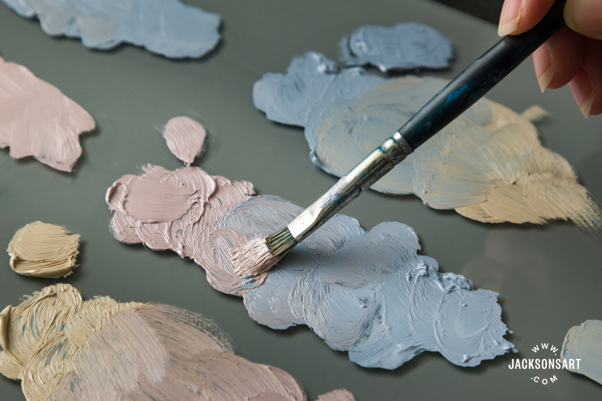
The set includes three full-size 37 ml tubes of Gamblin Artist Oil colour in a card insert, tucked inside a cradled, ready-to-use painting panel. The sleeve showcases the muted tones one can expect to create – an inspiring preview! I tested the paints both as a stand-alone set and alongside other colours on Jackson’s Oil Paper Block.
The colours included are Titanium Buff, Portland Warm Grey, and Portland Cool Grey. They are all bound in linseed oil, with moderate drying times, and are predominantly opaque pigments that could all be described as mid-value. In this article, I demonstrate these three colours straight out of the tube, with thinner, and using a glazing medium to gauge opacity. Even with manipulation, they remain quite opaque and high covering.

Titanium Buff
Pigments: PW6 (Titanium Dioxide)
Series: 1
Opacity: Opaque
Lightfastness: Excellent
This single pigment colour, a titanium and iron oxide compound, is a warm yellow-grey. It appears slightly lighter in value than the others and is marginally less opaque. It holds up well in admixtures and has great covering power, but brushes out more readily to a semi-opaque paint film. This colour is widely used, sometimes named Unbleached Titanium. It is useful in landscape and figure painting and, with a dab of intense, cool blue, can produce lovely teals.
Portland Warm Grey
Pigments: PW6, PR101, Pbk11 (Titanium Dioxide, Synthetic Red Iron Oxide, and Synthetic Black Iron Oxide)
Series: 2
Opacity: Opaque
Lightfastness: Excellent
The oxides in this paint are commonly used to make Indian or Venetian Red and Mars Black. Red Iron Oxide can sometimes lean towards violet, which I detect a hint of in the colourmass. Brushed out, though, this is a warm red-grey. It is a beautiful colour for a dusky sky and would be very useful in figure or portrait painting.

From top: Titanium Buff, Portland Warm Grey, Portland Cool Grey
Left: With thinner added in increments
Right: With a glaze medium added
Portland Cool Grey
Pigments: PW6, PB29, Pbk11 (Titanium Dioxide, Complex Silicate of Sodium, and Aluminium with Sulfer, and Synthetic Black Iron Oxide)
Series: 2
Opacity: Opaque
Lightfastness: Excellent
PB29, the pigment imparting the blue hue, is also used to make Ultramarine Blue and can vary from green shades to cool pink. Though PB29 is typically transparent, this paint is very opaque. While it’s a cool blue-grey, there’s a hint of warmth to my eye, likely due to the warm black pigment. This would be beautiful in landscape painting, for skies and shadows. I sometimes use a similar colour as a base layer – just as an orange ground imparts energy, a muted blue one can bring calm.

Adjusting the Values of the Mixing Greys
Containing my urge to immediately mix all the colours, I first experimented with lighter and darker versions of each. I worked with Winsor & Newton’s Titanium White (PW6, PW4) and Mars Black (Pbk11), but – for greatest accuracy – you could try the other Portland Greys in the Gamblin Artist Oil Paint range. Portland Greys Light, Medium, and Deep are formulated at different Munsell values to assist in easy value adjustments.
Given Black Iron Oxide’s high tinting power and the potential dulling effect of Titanium White, I wasn’t sure what to expect. Yet, even Titanium Buff, the mildest of the set, held up well. At a 25% ratio of colour to black, all retained influence on the dark greys’ undertone. Likewise, none were washed out by the white but rather produced a fairly balanced range of pastel tints. Titanium Buff looked slightly paler at 20% colour to white, but this could be easily tweaked.

From top: Titanium Buff, Portland Warm Grey, Portland Cool Grey
Left: Mixed in increments with Titanium White
Right: Mixed in increments with Mars Black
Titanium Buff achieved a range of warm, sandy greys; the darkest of them was reminiscent of Davy’s Grey. Portland Warm Grey ranged from soft pinks with the white, into mauve-like greys with the black. Portland Cool Grey produced bright cool pastel blues through to an ashy dark grey.
Using the Set of 3 Mixing Greys as a Limited Palette
The definition of a ‘primary colour’ is no settled matter. Cadmium Red, Cadmium Yellow, and Ultramarine Blue will yield a very different set of secondaries to a process mixing set comprising Magenta, Cyan, and Process Yellow. Whatever the approach, balance is important. Gamblin’s three muted primaries were designed perfectly to be used together. The limited pool of pigments used ensures admixtures are harmonious.

From top: Titanium Buff mixed with Portland Warm Grey, Portland Warm Grey mixed with Portland Cool Grey, and Portland Cool Grey mixed with Titanium Buff
These mixing greys invite curiosity and exploration of colour combinations. I particularly wanted to see the secondary colours with their complementary primary. In isolation on the palette, the green-grey looked quite… grey. With its counterpart, the green hue came to life.

Top row: The three primary greys
Bottom row: Their secondary colours; a muted purple, green and orange
Mixing the Greys With Other Colours on the Palette
This muted spectrum is appealing in its own right, but also useful for a more vivid palette. Colours straight from the tube are appealing in their intensity, but that often needs to be reduced to achieve nuance in a painting. Chroma can be reduced by adding a little of a complementary colour, or with the addition of neutral greys or earth pigments. To see this first technique in action, here are three transparent, single pigment secondary colours paired with their complementary grey.
At the grey end, these look similar to the colours achieved by mixing the muted primaries. At the other end, the greys have slightly reduced the intensity and increased neutrality of their complementary colour.

Top row: Titanium Buff and Ultramarine Violet
Middle Row: Portland Warm Grey and Viridian
Bottom Row: Portland Cool Grey and Transparent Orange
The muted primary set offers a different approach. Gamblin Oil Paint’s Mixing Greys are designed to reduce the chroma of yellows and oranges with the Titanium Buff, to subdue oranges and reds with Portland Warm Grey, and reduce violets, blues and greens with Portland Cool Grey. We can reduce the chroma without sacrificing so much of our original colour’s clarity. Applied consistently, this approach can help to unify a palette, bringing cohesion to a painting.
I tested each mixing grey with three corresponding colours commonly used in different mixing palettes. Each is mixed with a strong, nearly process colour; a traditional mixing colour; and the colour closest to each grey’s hue.

Portland Cool Grey mixed with Phthalo Blue Lake, Cobalt Blue, and Ultramarine Blue

Portland Warm Grey mixed with Quinacridone Magenta, Cadmium Red, and Red Iron Oxide

Titanium Buff mixed with Lemon Yellow, Cadmium Yellow, and Raw Sienna
With only a small addition of the grey, each colour is slightly muted, and the opacity of translucent colours is increased. With very high inclusions of the grey, the qualities of the hue are still evident. The Cadmium Yellow remains warm and sunny; the Red Iron Oxide retains its richness throughout; and the green undertone in the Phthalo Blue is still very much a core characteristic. One of Gamblin’s aims is to ”Give artists colour at its maximum” and I’d say that, even while designed to reduce colour, this is achieved with these greys.
Putting the Muted Spectrum to Use
A perfect opportunity to use up all these greys I’ve just mixed came courtesy of the packaging. Minimally wasteful (the only plastic to be found is in the tube caps), the paints came packaged in this 6 x 6 in panel. I decided to take a different look at my muted spectrum.

It’s a lovely panel to use. The absorbency allowed the paint to settle quickly, but not so much that I couldn’t reactivate it, adjust brushmarks, or even take it back to white when needed – useful as I nudged my colours to the correct angles for my colour wheel. I only painted one layer, adding a little body as I went; however, the characteristics of the Gamblin Oil Paints are already evident.
Final Thoughts on Gamblin’s Set of Three Grey Colour Mixing Oil Paints
There are many paths to the perfect shadow. All too often in my search for the perfect grey, I’ve ended up with far more paint than I needed after too many tweaks and adjustments. That’s why a set of premixed colours like this can be so appealing; achieving consistency throughout a painting is simplified. Gamblin Oil Paint is designed not just to serve artists but to inspire them, and the more I worked with these colours, the more possibilities seemed to unfold. Whether used to unify shadows, chroma control, or as a subtle palette on its own, these three mixing greys are muted but certainly never dull.

Offering muted colour harmony, precise chroma control, and the intrigue of a limited palette, the Mixing Greys in this set function as mid-tone primary colours. Their colour mixing potential makes them a valuable addition to the toolkit of many oil painters, regardless of subject matter. Even when manipulated, the paints remain relatively opaque and high-covering, ideal for building confident, subtle layers.
For artists looking to explore a more nuanced approach to colour while maintaining control and versatility, this set offers a thoughtfully balanced and practical solution.
Further Reading
In Conversation with Pete Cole of Gamblin
Colour Mixing: Colourist Painting with Three Colour Palettes
Gamblin Oil Colour: Choosing From Their Many Whites
Shop Gamblin Oil Paints on jacksonsart.com
The post Review of Gamblin’s Set of Three Grey Colour Mixing Oil Paints appeared first on Jackson's Art Blog.
Trending Products