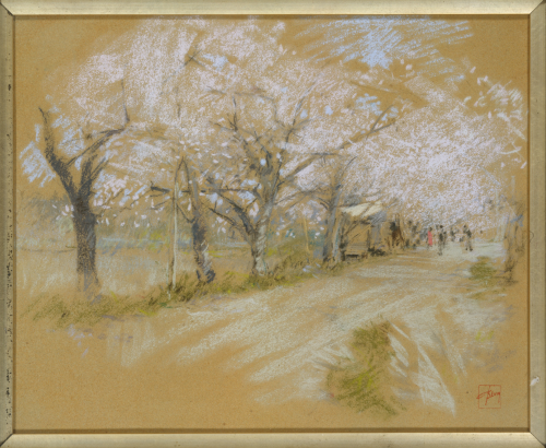
Recently, as I was cruising through the Met Museum’s website, I stumbled across Spring Landscape, an evocative pastel by Robert Frederick Blum. I was immediately drawn in by its lightness and confident handling—but also surprised that I’d never heard of the artist before. Even more intriguing? Blum was not only a friend of the more well known artist William Merritt Chase but also co-founded the Society of Painters in Pastel with him in the United States.
I often dive into figurative or more complex work when doing these close-up analyses, but this time I couldn’t resist taking a closer look at this pastel landscape. So for all you landscape artists out there—this one’s for you! (I did discover some beautiful figurative pieces in Blum’s oeuvre too, so watch this space for a future post.)
Let’s have a look at the overall painting:

The first thing I noticed (which makes sense for a springtime painting) is how light the piece is. There are very few darks and those are definitely not what I’d call a dark darks! This is a high key painting with the middle values and darks supporting the lights of the blossoms.
Check out the black and white version of the painting to see what I mean:

The next thing to notice is his use of a warm mid-value paper (sandpaper the catalogue says) which vibrates beautifully with the mostly cool light-coloured and white pastels over it. The paper becomes part of the piece. Blum uses the vignetting technique beautifully! You might want to go back and have another look.
We see a wide path used by pedestrians and lined by springtime flowering trees. This painting certainly is about those trees! Look at the way he portrays them. He covers broad areas with the side of the pastel using a light pressure which allows the warm coloured paper to show through. In some areas, for instance, the lower parts nearer the foreground and the upper contour edges, he dabs the pastel on, reflecting the general shapes and sense of blossoms. He doesn’t need to apply the pastel in this manner everywhere – a few dabs will tell us the whole story.

The sky colour is the same value as the white he uses for the blossoms. You can see when it’s placed next to the blossoms how difficult it is to see that blue but, by itself against the mid-value paper, it shows clearly. A few linear strokes and dabs here and there give us what we need to know.

It looks as though Blum first drew in the trees on the paper, then added the blossoms over the top. Have a look.

In the area above the figures, Blum seems to have drawn a branch in, then decided to cover it with blossoms rather than add pastel to show the branch. If you look back at the entire painting, can you see how that decision makes the painting all about the whiteness of the blossoms rather than the tangle of branches or the people?

Any preparatory drawing done by Blum on the paper is mostly hidden – the charcoal lines (?) remain visible in only a few places. Some of the most clearly seen are those defining the structure we see in the distance. Notice how little pastel Blum adds to the paper and yet we can see that it’s a building of some sort.

Along with the structure, the figures in the background add life and a human element but they are subsidiary to the flowering trees in the spring landscape. We might hardly look at them if it weren’t for the subtle (not so subtle?) addition of that pale red-orange dress! That small difference alerts us to the figures as figures.

The diagonal line of the trees and road move us “into” and across the picture plane – left to right. Notice how the change from diagonal pastel strokes to strokes that go across the paper, slow our eye, and, along with the figures and a darkish line on the far right, stop us from going straight off the paper.

Blum’s clever use of hatching brings us back into the foreground and to a green shrub at lower right. Then our eyes are led across (following the diagonal line created by the start of the path, and upward to the strong dark vertical of the first tree. Subtle ways to move our eye through the painting!


Blum puts aerial perspective to good use in the background where an open field stretches back to what may be trees in the distance.

Lastly, I wanted to bring your attention to Blum’s signature. It’s a stamp of sorts but it’s the simplicity and beauty of it that I want you to notice. Also the red colour is a similar value to the paper so it doesn’t jump out at us.

Blum knew James McNeil Whistler – he was his neighbour on a two-year stay in Venice starting in 1879. Whistler instructed Blum on the principles of Japanese design. And it was in fact Whistler who introduced Blum to pastels.
Let’s have another look at the whole painting again:
Looking at Spring Landscape through this lens, I hope you’ve gathered a few ideas to take into your own landscape work—especially when you’re painting en plein air. Blum’s subtle use of value, his respect for the paper surface, and his ability to suggest rather than overstate are all brilliant reminders that less can often say more!
I’d love to hear what stood out most for you in this painting. Was there a particular part of Spring Landscape that sparked something for you? Please do leave a comment!
Until next time,
~ Gail
Trending Products