

In this article, I explore the techniques used in Tonalism by looking at the qualities of artworks from the movement. Among its leading figures were American painters such as James McNeil Whistler and George Inness. I then demonstrate how to create your own Tonalist works in painting and drawing media. Articles in the Techniques Series define the meaning and context of art making processes and give practical tutorials on how to work with them.
Tonalist Techniques in Painting and Drawing
Definition: Tonalism refers to artworks with a restricted palette of colours, which exist within a narrow variation of dark tones. These muted palettes lend themselves to nocturnal scenes, suggesting dusk or dawn, often depicting the landscape or people. ‘Tonalism’ refers to both the painting technique and the late 19th-century American art movement that originated the term.
What is the Effect of Tonalism?
Tonalism has a contemplative, quieting effect, with its muted palette and sombre tones evoking the quiet stillness of dusk. Tonalist works often evoke a feeling of loneliness, as if you have come across the dying light on an evening walk, or seen another person absorbed by their own thoughts at the end of the day. This sense of the day ending prompts thoughts on mortality and time, suggested by the restricted palette and minimal detail.

The History of Tonalism
Tonalism emerged in 1880s America, led by a group of painters inspired by the earlier Barbizon group of 1840s France. The Barbizon artists had fought to have landscape painting recognised as a valid subject in its own right, without the need for mythological or religious justification. Before this point, landscape was largely considered a device for constructing figurative paintings. These artists travelled to the countryside and forests around Paris to work and immerse themselves in the land. The Tonalists admired the Barbizon painters who were driven by the human desire to convey the experience of their personal surroundings over narrative. From this idea, they developed Tonalism to provoke emotions in the viewers of their paintings, rejecting both pure representation and narrative. This aligned with how they felt classical music was composed, striking emotional chords in audiences without prescribing the story they should imagine whilst listening to it.

Sunset in the Woods, 1891
George Inness
Oil on canvas, 122.2 x 183.2 cm | 48.2 x 72.2 in
National Gallery of Art
George Inness was key to developing Tonalism, painting landscapes with a greater focus on atmosphere than on grandeur. In 1860, after struggling with poor health due to epilepsy, he moved from New York to Massachusetts, hoping the fresh air and natural surroundings would improve his condition. He returned to the same area in 1875, where he painted his way around the White Mountains, this time imbuing the paintings with an introspective feeling and a deeper palette. By the 1890’s he had fully embraced the cerebral effect his Tonalist landscapes carried.

Evening at Medfield, Massachusetts, 1875
George Inness
Oil on canvas, 96.5 x 160.3 cm | 38 x 63.2 in
The Metropolitan Museum of Art
James McNeill Whistler is perhaps the most internationally famed of the Tonalist painters. He began composing his paintings like musical arrangements, and in reference to classical music, he created a series called his Nocturnes. Of this, he wrote: “By using the word ‘nocturne’ I wished to indicate an artistic interest alone, divesting the picture of any outside anecdotal interest which might have been otherwise attached to it. A nocturne is an arrangement of line, form, and colour first.”
One of the most well-known works from this series is Nocturne in Black and Gold, the Falling Rocket, painted after he watched a fireworks display in London. The critic John Ruskin publicly attacked the piece, saying, “I have seen, and heard, much of cockney impudence before now; but never expected to hear a coxcomb ask two hundred guineas for flinging a pot of paint in the public’s face.” His comment reflects the traditionalist attitude to Whistler’s experimental new works.

Nocturne in Black and Gold, the Falling Rocket, 1875
James Abbott McNeill Whistler
Oil on panel, 60.3 x 46.7 cm | 23.7 x 18.4 in
Detroit Institute of Arts
Whistler worked by the phrase “art for art’s sake” in rejection of the belief that painting should solely record reality, tell a story, or depict moments from history. Ambiguity was a key aspect of his paintings, which doesn’t seem like such an unusual quality for an artwork to have now. But in his time, American painting was predicated on dictating a narrative.
His most famous painting, Arrangement in Grey and Black No.1, more commonly referred to as Whistler’s Mother, has been endlessly parodied and referred to in popular media. He originally intended for the painting to be purely an arrangement of greys and blacks, almost close to an idea of abstraction, with his mother being the framework for this tonalist idea. Despite his intentions, it became an archetypal image of motherhood, conveying a whole host of emotive interpretations – from strength and disapproval to loss.
In a less famed work, Arrangement in Black: Girl Reading we see a similar pose in the sitter, but with a much deeper, midnight palette. This small tonalist work is intensely successful at combining various blacks and greys to imply the colours we would see if a light was shone on her, and perhaps comes closer to the earlier ideas on abstraction he had.

Arrangement in Black: Girl Reading, ca. 1880-90
James Abbott McNeill Whistler
Oil on wood, 22.9 x 30.5 cm | 12 x 9 in
The Metropolitan Museum of Art
Demonstration of Tonalism in Painting
I wanted to demonstrate some tonalist palettes for painting, since the technique is less about how the material is applied and more about the overall effect created by a series of aesthetic choices. A muted dusk-like palette is essential to perceiving tonalism in a work, and generally, these paintings were created in broader strokes, without intense detail. Painting in a muted palette with a narrow range of tones works for all colours, so I’ve mixed up three example palettes below using Jackson’s Professional Oil Paints, on sheets from a Jackson’s Oil Paper Block.
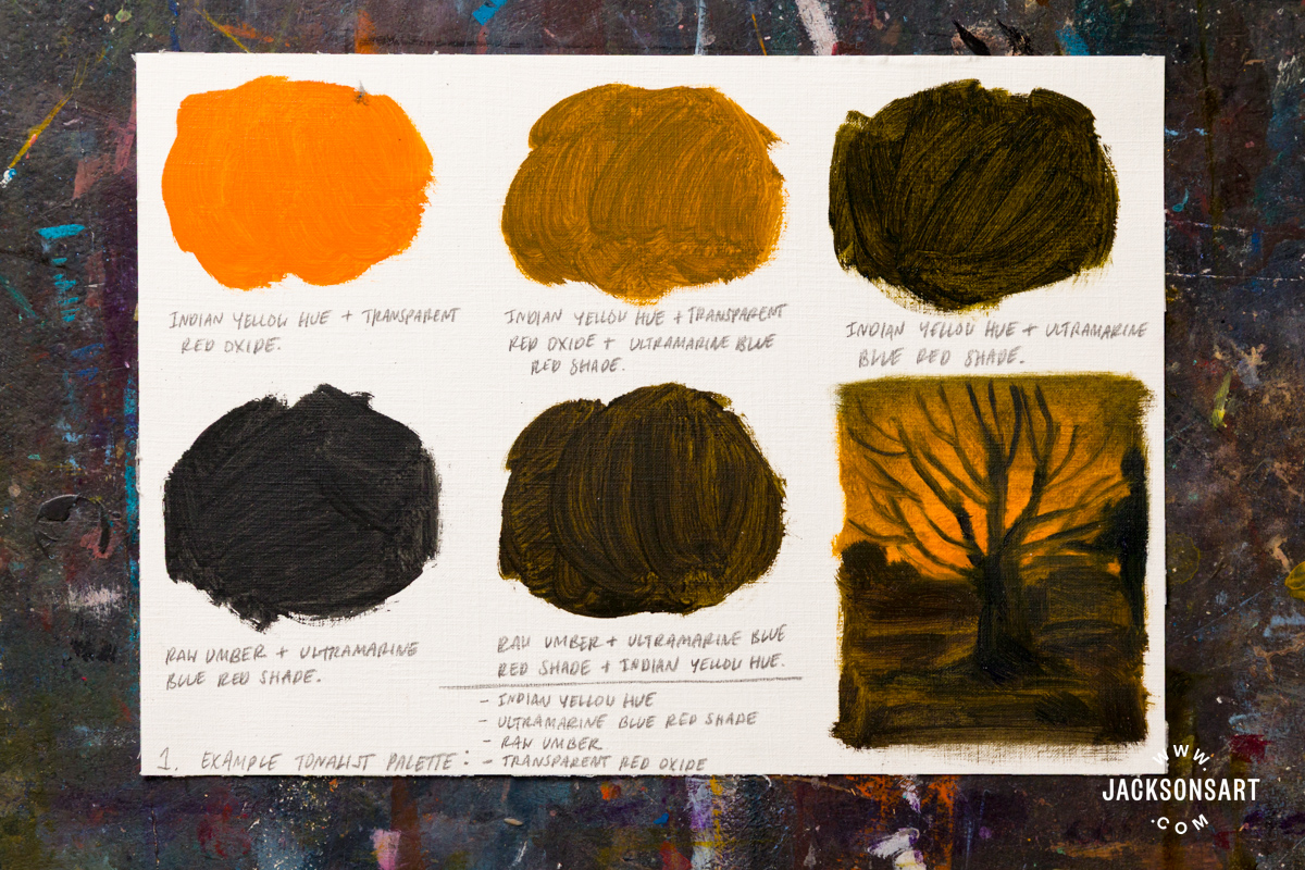
My first sheet shows swatches from a glowing amber palette, made with a combination of four colours: Indian Yellow Hue, Ultramarine Blue Red Shade, Raw Umber, and Transparent Red Oxide.

My second palette forms a cool forest at twilight, using a combination of five colours: Cobalt Blue Genuine, Indigo, Yellow Ochre, Quinacridone Magenta, and Warm White.
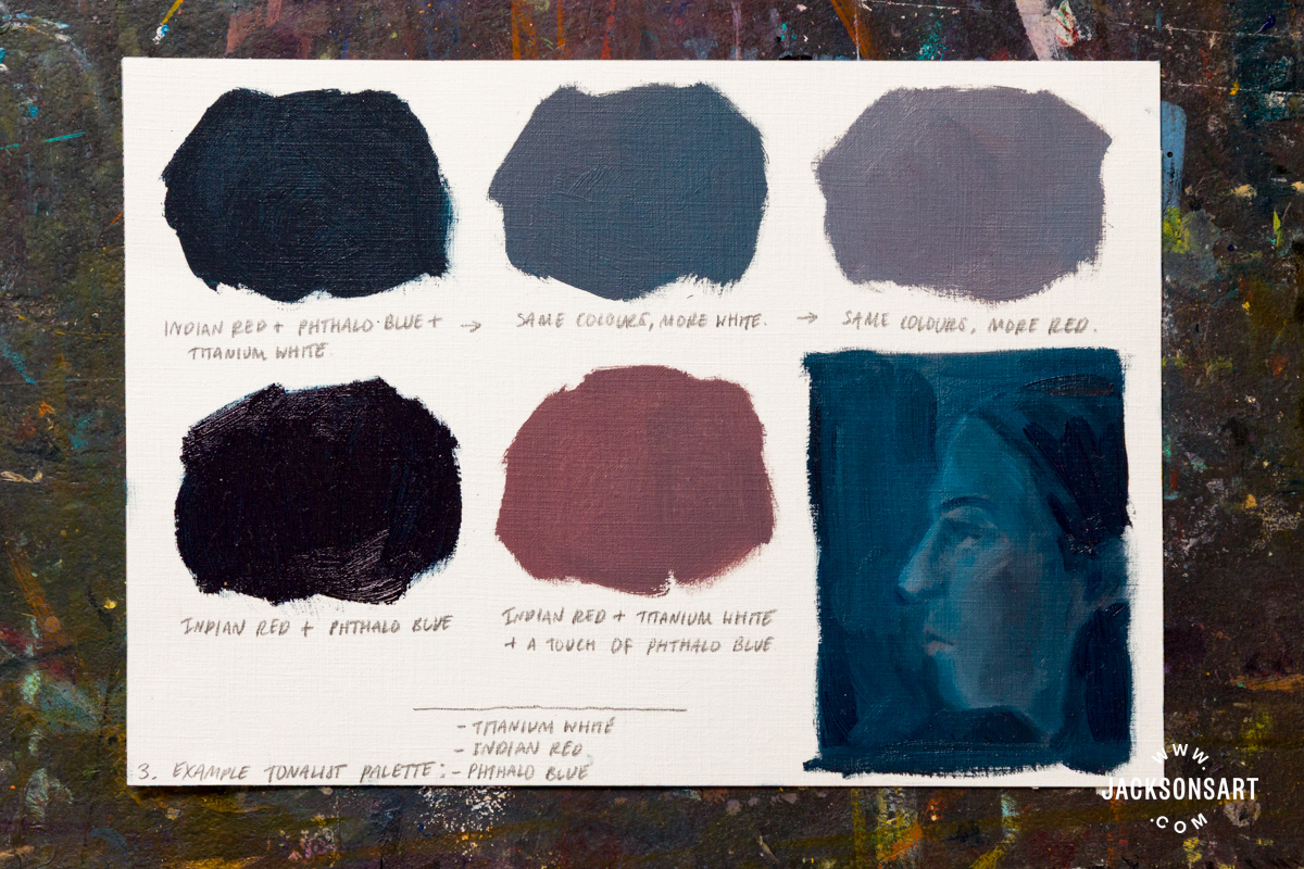
My third sheet uses just three colours to create a dusky nocturnal palette: Indian Red, Phthalo Blue, and Titanium White.
Next, I worked to apply my first palette to a landscape from my imagination, with a glowing light creeping in beyond the horizon. For this painting, I worked on a sheet from a Jackson’s 100% Cotton Canvas Pad.

To begin my painting, I applied a coloured ground in Cadmium Yellow Deep Genuine to immediately establish a unified colour for the work. And so that I could allow areas of it to show through later. If I worked straight onto the white, the colours I applied later may have allowed too much white through in areas of transparency, defeating the tonalist effect.

I built in the broad placement and shapes in my landscape using a warm midtone.

Next, I layered on some darker areas, picking out details like the trees and texture of the clouds.

I went back over the painting to refine some details, increase the depth of the blacks, and pick out a couple of more subtle highlights.

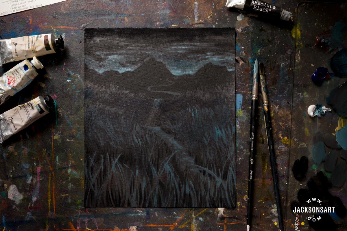
Next I wanted to make an example in acrylic, working on top of a ground of black gesso. The black below the paint effectively made me work using the reverse logic of the previous painting, since I had to apply the light rather than the dark. For this example I worked on a sheet from a Jackson’s 100% Cotton Canvas Pad with four acrylic paints: Burnt Umber, Phthalo Blue, Titanium White, and Absolute Black: Jackson’s Edition.

I covered my canvas sheet in black gesso and allowed it to dry.
Beginning at the top, I picked out the light dispersed under the clouds, which frame the shape of the mountains in blue-greys.
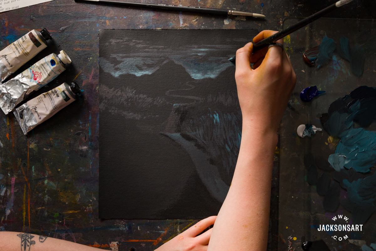
I worked my way down the painting, picking out where the dim light catches the grass and path.

To complete the work I wanted to use an even darker black to heighten the contrast at the foreground, so I applied Absolute Black: Jackson’s Edition between the highlights on the grasses.

Tips:
If you feel that your finished painting isn’t as dark as you’d hoped, or that it dries with areas of brightness that you’d like to dull down, the solution could be glazing. Choose a dark transparent or semi-transparent colour for this, like Indigo, Payne’s Grey, or Violet Dioxazine.
Black often appears darker and has greater depth in paintings when it’s been mixed rather than applied straight from the tube. Two classic combinations for mixing strong blacks are Prussian Blue and Alizarin Crimson, and Ultramarine Blue and Burnt Umber.
Demonstration of Tonalism in Drawing
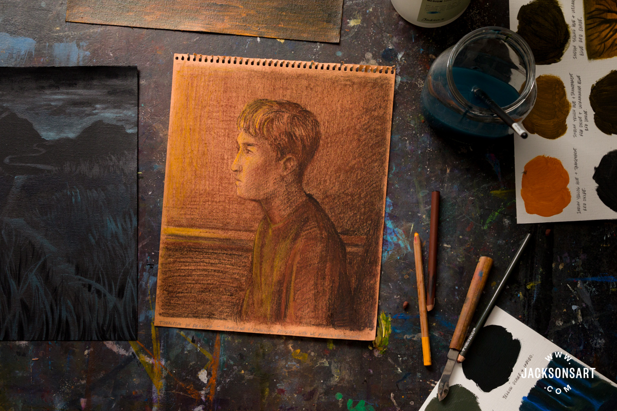
The nocturnal quality of tonalist paintings can also be achieved in drawings. For my example, I wanted to demonstrate making a tonalist portrait using a Conté à Paris sanguine and charcoal pencil, with dim highlights using a warm yellow Caran d’Ache pastel pencil.
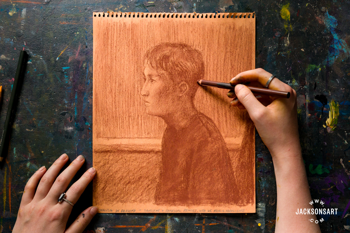
I began my drawing by establishing the work with a sanguine pencil, having predecided that this warm colour will be my mid-tone.

Next I worked with a charcoal pencil to add deeper, and the darkest tones to the drawing.

Then I picked out some highlights with a yellow pastel pencil.
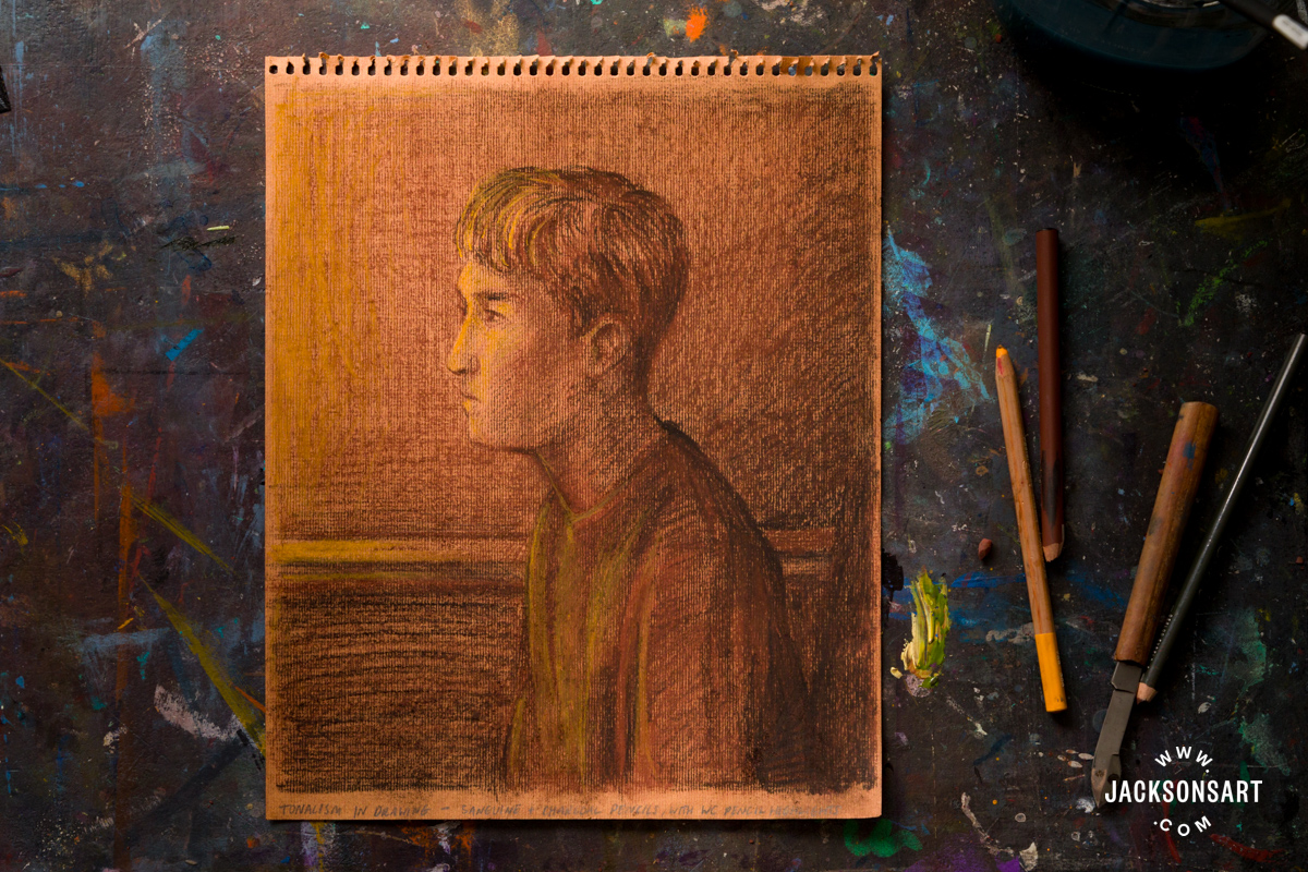
To finish, I selectively touched up detailed areas of the drawing, like the texture of the hair, and shadows on the wall.
Further Reading
Chromatic Black: Mixing Nuanced Dark Values
Exploring the Impact of the Victorian Colour Revolution
How to Resolve a Landscape Painting Composition
Does Mixing in Black to Darken Kill Your Colours?
Shop Art Materials on jacksonsart.com

The post Tonalist Techniques in Painting and Drawing appeared first on Jackson's Art Blog.
Trending Products